2025 is a breakthrough year for color: designers increasingly “break” conventional harmonies to create emotional, dynamic, and sometimes even provocative environments. Experimentation with palettes gives freedom to both professionals and enthusiasts—color inspires and allows you to express individuality.
Key Color Trends in 2025
- Combining bright, saturated hues
Energetic reds, sunshine yellows, ultramarine, and vivid fuchsia appear together for a “color expression” effect. - Unexpected contrasts
Powdery blues meet mustard yellow, rich chocolate pairs with neon lime, pistachio with coral. - Warm earthy and terracotta shades
Nature-inspired palettes—ochre, honey, olive and dusty rose—now team up with much “louder” accents. - Subtle, complex pastels
Lavender, seafoam, “dusty” orange and creamy mint are new favorites for universal design. - Metallic and chrome shine
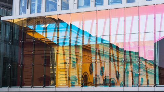
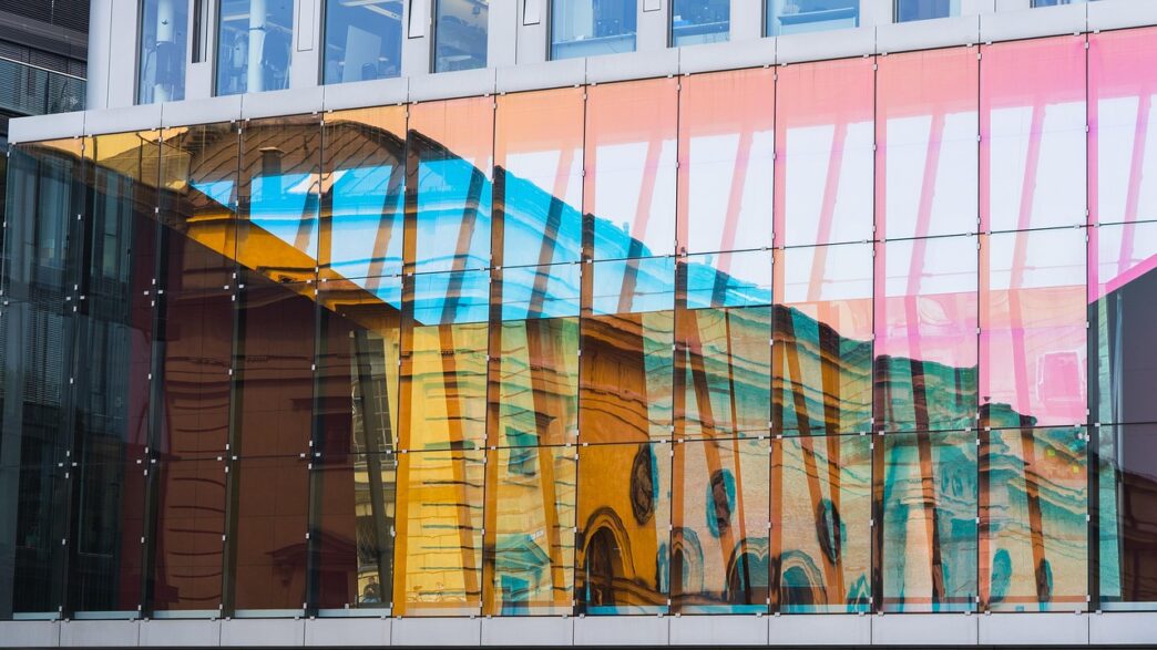
Liquid metal effects—from cool silver to oil-slick rainbows—appear in furniture, accessories and digital art.
How Are Designers Using Color in 2025?
- Freely blending nudes and super-brights (light beige + fuchsia)
- Lapis and turquoise shades with fresh acid highlights
- Contrasting warm sand with juicy lime tones
- Classic black and white—framed by neon borders
Top Colors of 2025 and Their Popular Pairings
| Main Color | Pairing | Typical Use |
|---|---|---|
| Ultramarine | Lime, silver | UI design, posters, textiles |
| Copper terracotta | Pale lavender | Interiors, packaging |
| Neon pink | Soft green | Fashion, digital illustrations |
| Mustard yellow | Powder blue | Graphics, branding, furniture |
| Chromed finish | Black, fuchsia | Installations, accessories |
Designers’ Perspectives on 2025 Color Influence
- Vibrant palettes — 35%
- Contrasts of past & future — 20%
- Nature-based hues with accents — 25%
- Soft pastels — 10%
- Metallic effects — 10%
Impact of Color Trends
- On interiors (multicolor furniture, bold walls)
- On fashion (neon/pastel pairings, wild prints)
- On graphic and branding (shattering stereotypes, pushing boundaries)
- On digital design (UI, animation, gaming environments)
The colors of 2025 are all about ultimate freedom and striking individuality. Experiment—don’t fear bold duets and seek inspiration at the crossroads of tradition and daring newness. These palettes and contrasts shape the mood of the year and become the language of new visual art.


